
Why Your Slides Keep Getting Ignored
How Pictures Unlock What Words Can’t

We’ve all been there. You sit down in a conference room—or log into Zoom—and the first slide comes up. It’s a wall of text: bullet points stacked like bricks, a tiny font no one can read, and zero whitespace. Within minutes, people stop listening. Some glance at their phones. Others zone out.
The presenter tried to put everything into words, assuming more text equals more clarity. In reality, the opposite is true: the more words you cram on a slide, the less people remember.
You’ve heard the old saying, “A picture is worth a thousand words.” That’s not just a nice phrase—it’s backed by decades of science.
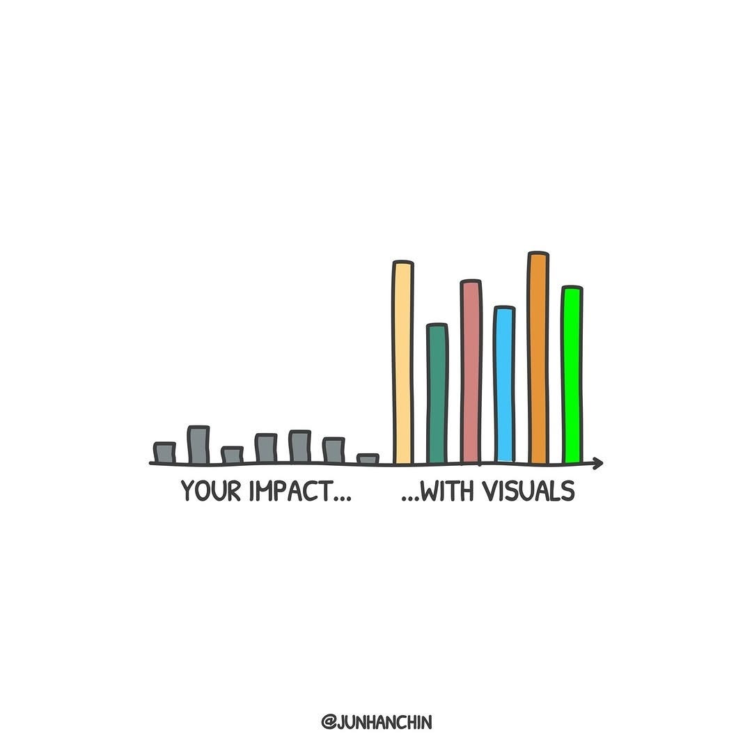
Image credit: junhanchin IG account
The Science Behind Why Pictures Stick
Psychologist Allan Paivio introduced Dual Coding Theory in 1971. His research showed that our brains have two channels for processing information: verbal and non-verbal (images). When information enters both channels at once, recall goes up dramatically.
Building on this, Nelson, Reed, and Walling coined the term Picture Superiority Effect in 1976. Their experiments confirmed that people recall images far more effectively than words. On average, people remember about 65% of what they see after three days, compared to only 10–15% of what they read or hear.
Another famous study by Lionel Standing pushed this further. In 1973, he showed participants 10,000 pictures over the course of several days. The astonishing result? People still recognized more than 80% of the images afterwards. Try remembering 10,000 bullet points—you wouldn’t get close.
The lesson is simple: our brains are wired to hold onto images. Words fade fast; pictures linger.
The Power of One Visual
Look at the prism image above. One event splits into countless interpretations. No paragraphs were needed to explain it—you understood instantly. The visual carried the meaning, not the text.
Now think about your own work. How often are you asking executives or teammates to wade through bullet lists when a single diagram could land the point in seconds?
Examples in Technical Presentations
Visuals aren’t decoration. They’re shortcuts to understanding, especially in complex fields such as engineering or data science.
Cloud Migration Strategy
Instead of five text-heavy slides listing legacy systems and new platforms, show one diagram: “before vs. after” system flows. Executives will grasp the change in 30 seconds.Cybersecurity Risk
Replace paragraphs about vulnerabilities with a heat map showing risk levels across regions or products. At a glance, leaders see where to focus.Machine Learning Pipeline
Instead of dense definitions, display a flow diagram: raw data → training → model → predictions. People will remember the shape of the process long after the meeting.
These aren’t “nice to have.” They’re the difference between your audience getting it or getting lost.
How AI Can Help
The good news: you don’t need to be a designer. AI tools like DALL·E, MidJourney, or Stable Diffusion can generate powerful visuals from simple text prompts.
Here are a few you could use in your own decks:
“An illustration of a gardener training vines along a trellis, representing algorithms learning from data.”
“A flow of water splitting into channels, representing supervised vs. unsupervised learning.”
“A fortress wall with glowing doors, representing cybersecurity layers and access controls.”
“An old map showing trade routes, representing data pipelines moving across systems.”
Each of these conveys a technical idea without jargon. They stick because they work with the way the brain actually learns.
Bringing It Back to You
The next time you’re tempted to fill a slide with words, stop and ask: What’s the one image that could carry this idea?
Remember:
More text doesn’t equal more clarity.
People forget 90% of what they read.
They remember images long after your meeting ends.
Your job isn’t to show you did the homework. It’s to make the audience see the idea.
A Practical Challenge
For your next presentation, pick one slide that’s text-heavy. Strip out the words. Replace it with a single picture or diagram. Then watch how the room reacts. You’ll notice people leaning in instead of tuning out.
Ready to Build Better Slides?
If you’re tired of hearing feedback like “too many slides” or “this is too dense,” it’s not your content—it’s your design. That’s exactly why I created Slidesmith – Build Executive Slides That Work.
In this digital course, you’ll learn a repeatable system to:
Replace walls of text with visuals that executives remember.
Turn technical complexity into simple, persuasive stories.
Build decks that land your message the first time.
You don’t need more slides. You need the right ones. Slidesmith shows you how.