
AI is the Brush, Not the Artist
A Product Manager’s guide to using Gemini to "show, not tell" the path forward.

We’ve all been there. You receive a file from a 3rd party data source, and it’s a “black box.” You open it to find nearly a million rows of ship-to addresses—950,000, to be exact. It’s bloated, intimidating, and potentially full of noise.
In the “old world,” analyzing this would have been a multi-day saga involving SQL queries, pivot table crashes, and several back-and-forth emails with the engineering team just to define what we were actually looking at. However, as an individual contributor in an AI-first era, I knew there was a more elegant way to find the signal in the noise.
The Anatomy of the Analysis
Last week, I decided to take a different path. I sat down with Gemini and, in less than 60 minutes, transformed that mountain of raw data into a clear, actionable execution plan. The secret wasn’t just the AI’s processing power; it was the deliberate process of human-AI collaboration.
Here is exactly how I broke it down:
The Handshake: I uploaded the 60 MB CSV directly. Because I’m working within a modern context window, the size wasn’t an issue.
Context is Queen: I didn’t just say “analyze this.” I walked the AI through the columns, explaining what each attribute meant. AI performs best when it understands the intent behind the data.
Defining the North Star: I clarified that my goal was simple: identify patterns and hunt down duplicates.
The “Aha” Moments: Within seconds, Gemini surfaced the trends. I saw the top 5 countries and US states, but more importantly, it caught the “invisible” patterns—the various ways business names were formatted and five distinct recurring errors in street addresses that were masking duplicates.
Once the raw patterns were identified, the next challenge was making those insights digestible for the rest of the team.
From Rows to Roles (The Dashboard)
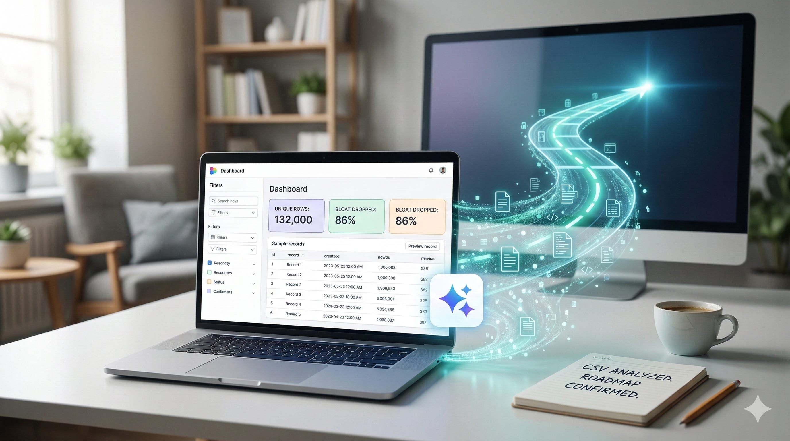
Data is only as good as your ability to communicate it. To make this “real” for my stakeholders, I switched to Canvas mode. I didn’t just want a static list; I wanted a functional tool. I built an interactive dashboard with three specific layers:
Layer 1: Dynamic filters to slice the data.
Layer 2: High-level tiles showing the “big numbers.”
Layer 3: A preview pane showing 10 example records based on the chosen filters.
The 13% Reality Check
With the dashboard live, the true scale of our task came into focus. The result was staggering. That “massive” 950,000-row file actually only contained 132,000 unique records.
The other 818,000 rows were duplicates, bloat, and noise. By identifying this, we didn’t just clean a file; we reclaimed hundreds of engineering hours that would have been wasted processing redundant data. This clarity transformed our upcoming technical sync from a discovery session into a strategy meeting.
The Human Element: Show, Don’t Just Tell
When I walked into the meeting with our engineering team, I wasn’t just bringing a status update; I was bringing clarity. Because I could show trends and visualize duplicates in real-time on the dashboard, the conversation shifted instantly from “What are we looking at?” to “When can we start?”
We agreed on a timeline and a focused scope of 132,000 rows right then and there. This 60-minute analysis didn’t just save time; it aligned the team around a shared truth.
The New Artist’s Palette
There are two quotes I’ve been thinking about a lot during this transition back to being an individual contributor:
“AI won’t replace humans, but humans who use AI will replace those who don’t.”
And perhaps more poignantly:
“AI is the brush. Humanity is the artist.”
While the origins of these phrases are often debated, their truth is undeniable in the field. AI didn’t do the thinking for me; it acted as a high-speed brush, allowing me to paint a clear picture of our strategy in a fraction of the time. If you aren’t using these tools to interrogate your data yet, you aren’t just missing a shortcut—you’re missing the chance to be the artist in the room.